Paint Consistency – What It Looks Like in Real Life
Paint Consistency – What It Looks Like in Real Life
In mandala painting, colors are beautiful — but paint behavior is what really matters. A dot only looks clean and controlled when the paint consistency is right.
This is a quick visual guide — not the full chapter from my book, just the essence to help you understand what to look for.
The Goal
A dot that settles nicely, holds its shape, has clean edges, and a soft, round “nipple” in the center.
If your dot looks like this — the consistency is spot on.
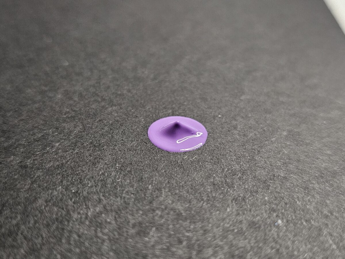
1) Purple dot – Too thick
What you see:
A sharp little peak in the middle that doesn’t settle. The surface has rings and the edges don’t round out fully.
What to do:
Add a small drop of medium (not water), mix thoroughly, and make a test dot on the same surface.
Adjust until the peak softens into that perfect nipple dot.
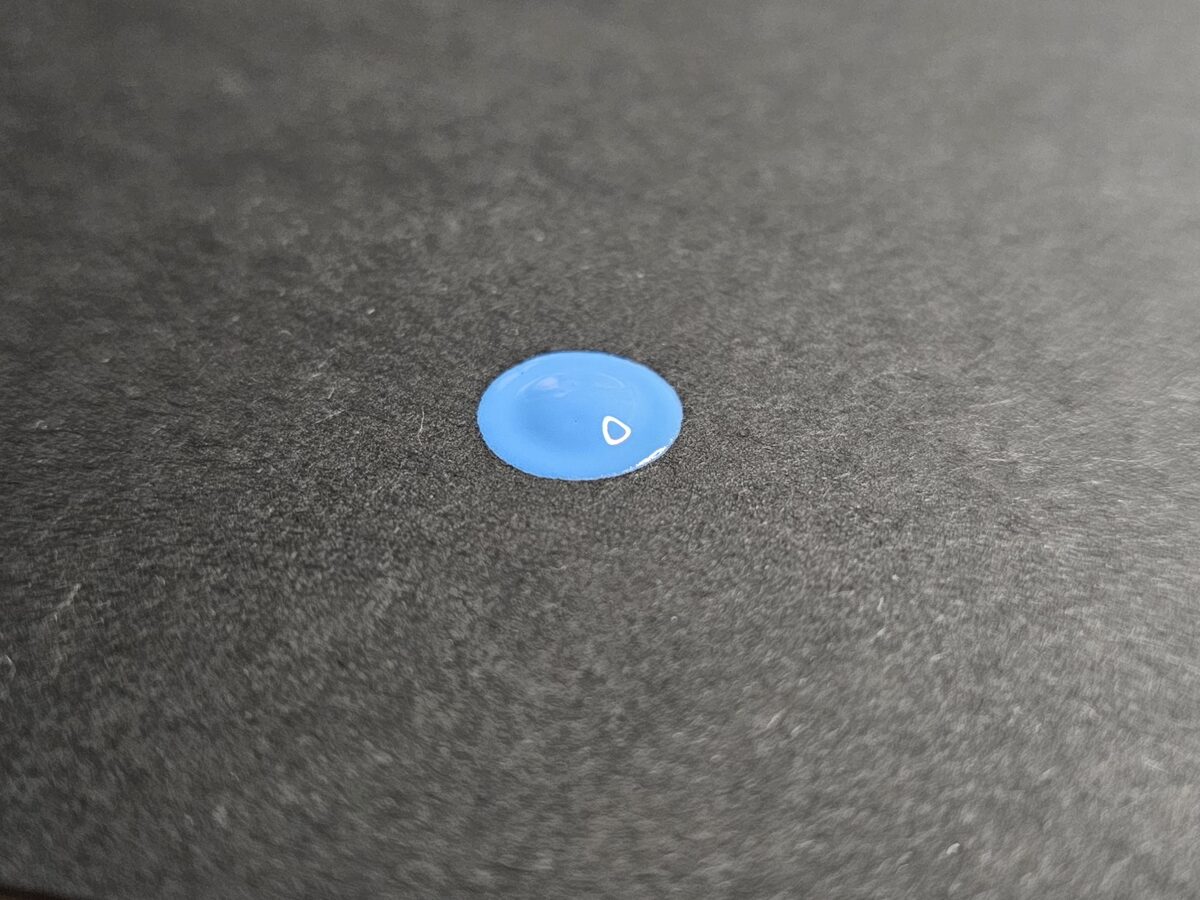
2) Blue dot – Perfect consistency (nipple dot)
What you see:
A smooth, slightly domed shape with a soft bump in the center. Clean edges, no spreading, stable form.
What it means while painting:
You get consistent, stable dots, good coverage, and full control.
Once you’ve hit this balance, mix a small extra batch with the same ratio so you can keep going without constant adjusting.
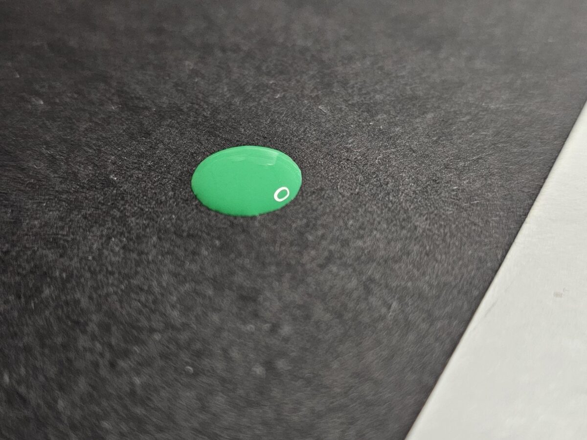
3) Green dot – Too runny (the paper slowed it down)
What you see:
Flatter shape, lower bump. It didn’t spread more because it’s on black cardboard — the porous surface held it back. On smooth surfaces like vinyl or porcelain, it would spread further.
What to do:
Work a bit of thicker paint back into the mix, stir well, and test again on the same surface you’re painting on.
Surface matters
The same paint behaves differently depending on the surface:
-
Porous (cardboard, plaster): less spreading, it “holds” the paint.
-
Smooth (vinyl, porcelain): more spreading, easier flow.
Always test a couple of dots on the actual surface you’ll work on. It saves a lot of frustration.
Why not water?
Water weakens the binder and can lead to cracks or fading later.
Medium keeps the paint strong — it only changes how it flows.
Final thoughts
Paint consistency isn’t magic. It’s practice.
Once you find that nipple dot consistency, everything becomes easier.
Here I only shared the essentials. In my book, there’s a full chapter dedicated to this: how I find the right ratio, adjust different brands and colors, and save a “bad” mix so it becomes usable.
If you’re serious about learning, that’s where you’ll find everything — step by step.
***